
Volaris is the most important Ultra Low Cost Carrier in LATAM with most routes in Mexico and from Mexico to the US
Contribution
User Experience Design, Interaction Design
Team
Andrea V., Erika
With an average 4.6 million monthly visits during 2017, the digital business was quickly expanding and becoming a key part of the company strategy. With clear goals like increasing ticket sales, cross selling and upselling ancillaries products and reducing the costs, the airline built an in house team that could translate the business objectives into digital objectives and then build the optimal experiences for our clients.
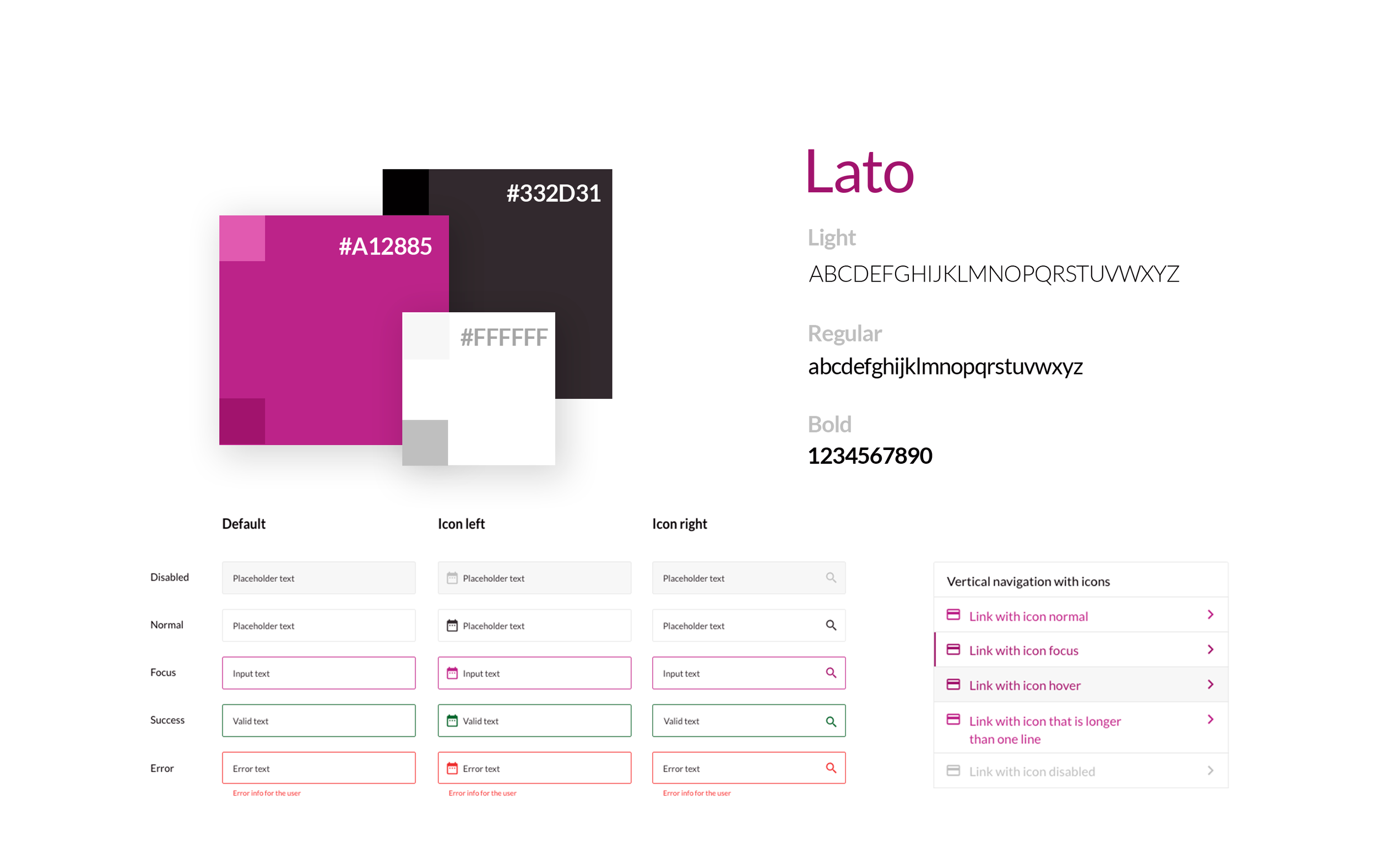
With the objective of increasing trust and building a stronger brand presence in our digital channels, we started to build a new web e commerce. Starting by aligning the brand identity with our digital platforms.
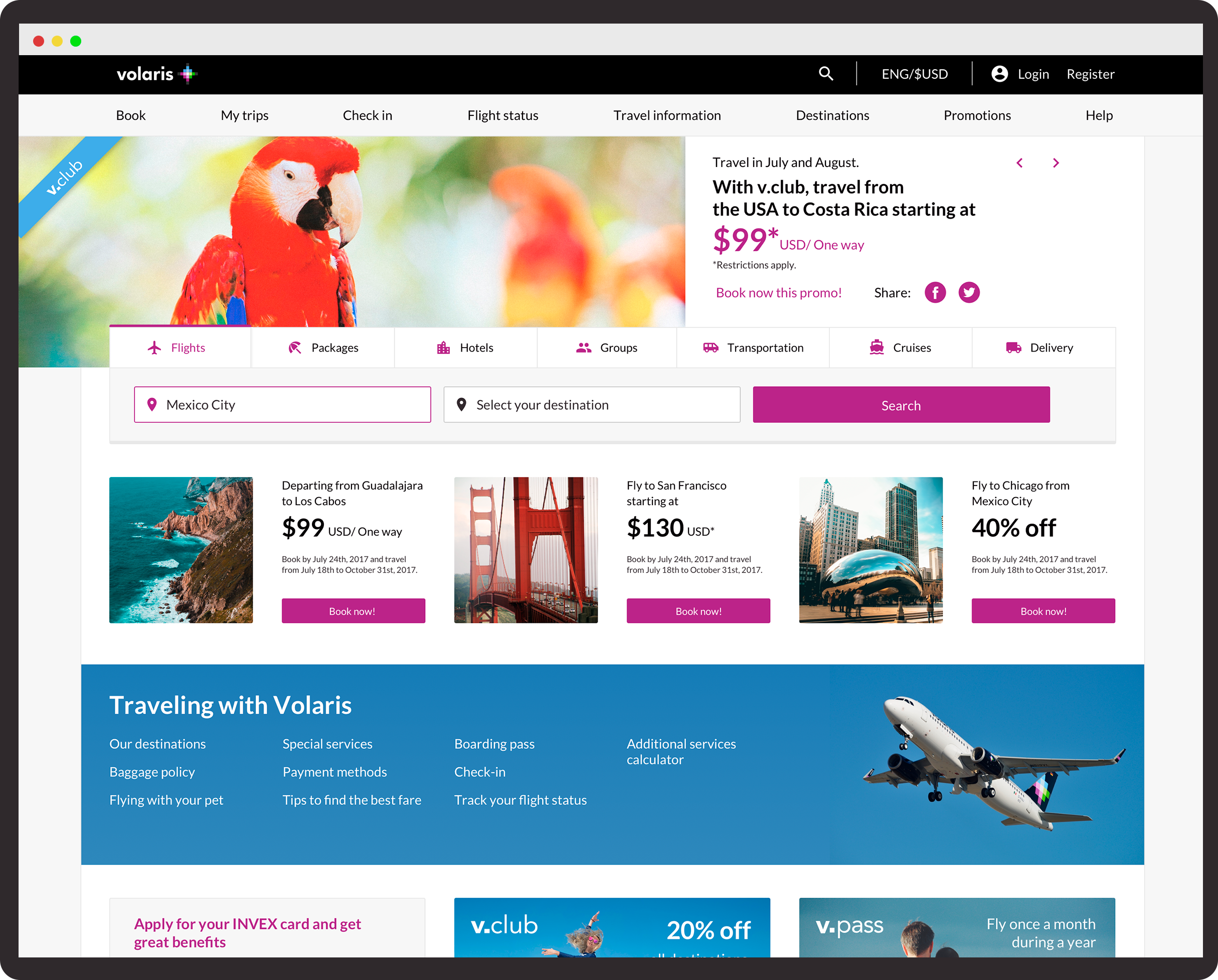
A site navigation that reflects the natural customer journey travelers
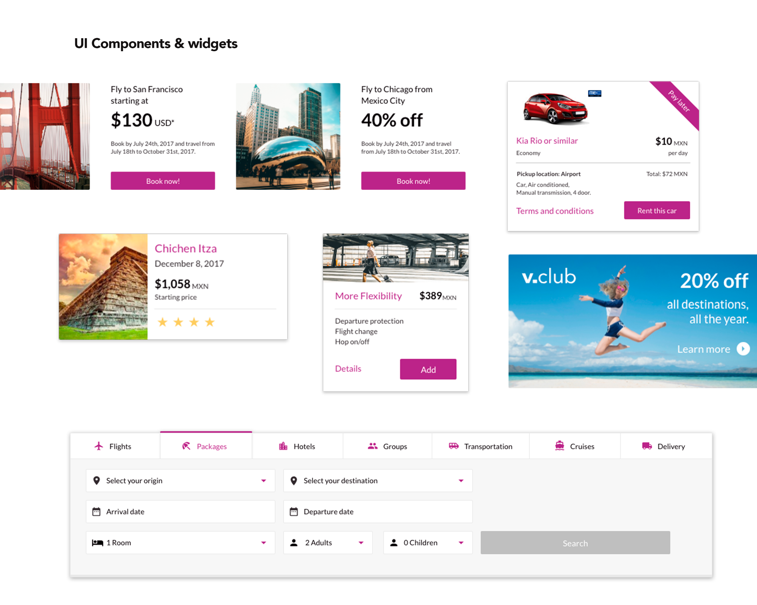
We build the main navigation considering the different touch points travelers goes by: starting by searching and finding the best deals. We provided with plenty of real state to our promotions carousel and search bar as this is the beginning of our customers journey and where impressions are crucial.
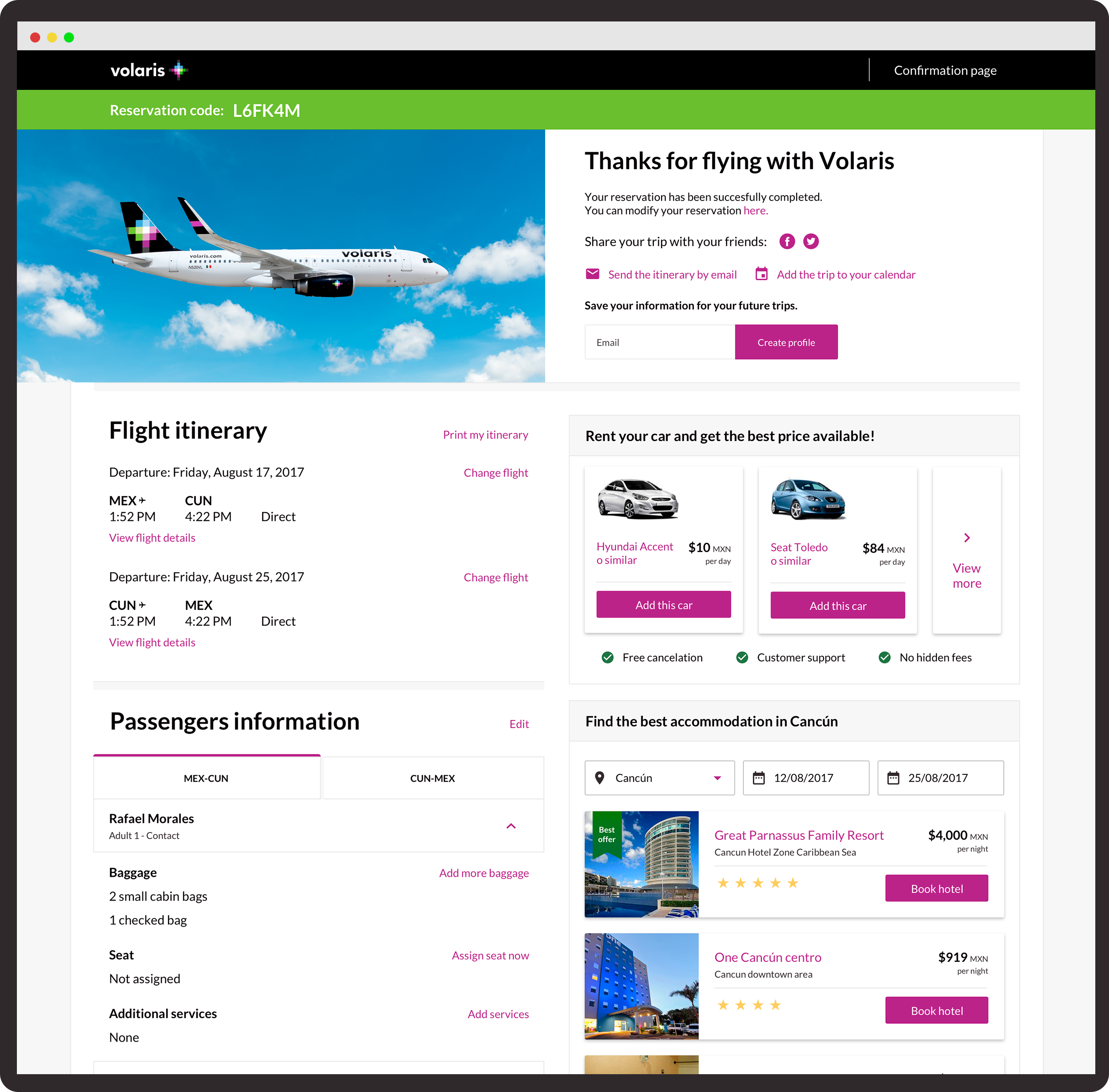
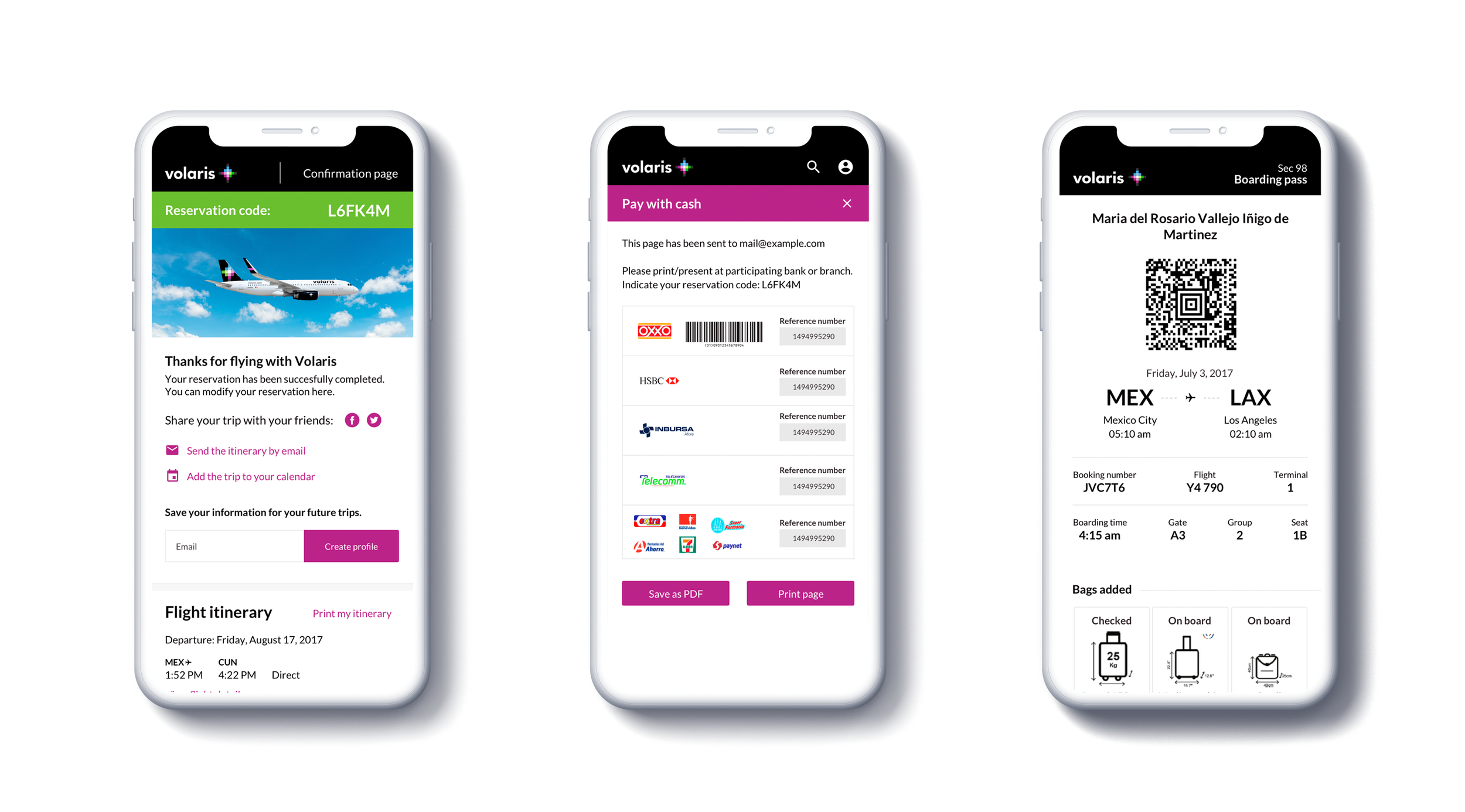
Moving forward, clients can access their booked trips, and manage their bookings. Offering them the chance to modify itinerary, add extra services or checkin from web and save time.
To build up retention and increase our customer retention, we also had our loyalty program (v.club) that offered special extra discounts, benefits and more benefits to recurrent customers.
Reducing friction to increase conversion rates
One of the biggest goals the project had was to see conversion rates increase, especially in mobile where we were only getting around 20% of our bookings. To achieve this we build up a mobile first responsive website. Always thinking in the constrains of a mobile screen and then expanding to a bigger viewport was part of the design approach.
A critical step with an overall conversion around 10-15% was the flight result page. A big challenge in this screen was how to clearly present a price calendar, the flight itinerary and all the different fares clients could access in a flight, all in a small mobile screen.

The pre-flight experience and the opportunity to increase ticket size
A key moment in the traveling experience is the time between you booked your flight and the date of flying. This is completely different depending on the travel type our clients were doing, but for most of our clients it was traveling for vacations.
The pre-flight experience as we called it, was a great moment to have touch points and offer our customers deals for accommodation, rentals or additional services that could make their travel experience better.
This was not limited to upsell or cros sell, it also included services like digital checkin within our mobile app for faster airport times. Viewing and managing your reservation online without having to contact the call center or digital channels like chatbots.
See next project